
![]()
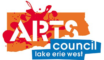 Arts Council Lake Erie West is dedicated to bringing art into everyone's daily lives, primarily through classes for non-professionals in ACLEW facilities or at off-site locations. Their greatest communications problem was differentiating themselves from the other two major local arts entities, the Toledo Museum and the Toledo Arts Commission. The visual images of the latter two organizations are very formal and corporate looking, so it was decided to create a visual identity for ACLEW based on the playfulness of actually creating art. The resulting logo exhibits the paint splatters, cut and torn paper and stencil lettering often found in children's art classes (although put together more professionally) and sets ACLEW clearly apart from the other groups.
![]()
When Owens Corning acquired a company which produced phenolic resins, a key component of reinforced fiber glass materials, they folded it into the company as the Resins and Coatings Division. For the first time, the company had both matrix and reinforcement technology, and they stood at the forefront of reinforced plastic composites development. They wanted a visual signature (but not exactly a logo) for the division which would serve to identify the new business both inside and outside of the company and position them as the industry leader in reinforced materials. Our solution was a flexible horizontal banner element which could be used as a header or a signature and which could change length to adapt to different width pages. The Owens Corning corporate logo was tagged at the right end of the banner. The theme "The Cutting Edge" reflected the desired positioning. The division has since been sold off again.
![]()
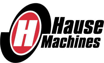 Hause machines is a small but high quality manufacturer of all kinds of machines for all kinds of manufacturing. It had languished for years as a family business in a small community in northwest Ohio until a savvy investor identified them as a sleeping giant and purchased the company. We were hired to produce a marketing plan as aroadmap to the future, and part of the plan was to make the company look like the aggressive, forward moving business its new owner hoped it would be. The new logo we designed as our first project reflected this thinking with its forward tilt, its beefy typography and the machine-like rotational energy generated by its outer shape.
![]()
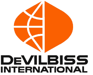 The DeVilbiss Company, manufacturer of spray equipment worldwide and long one of Toledo's leading industries, had over the years developed significant export sales and wished to break that business into a separate division.
We were asked to design a logo which kept the character of its basic corporate graphics with an international twist. Keeping the distinctive typography and familiar orange and black color scheme, we turned the traditional DeV ligature into a contemporary stylized globe. The globe by itself became a frequently used graphic elements in promotional materials, often with photos in one or more of the shapes. The company has since been purchased and moved out of Toledo by Ransburg.
The DeVilbiss Company, manufacturer of spray equipment worldwide and long one of Toledo's leading industries, had over the years developed significant export sales and wished to break that business into a separate division.
We were asked to design a logo which kept the character of its basic corporate graphics with an international twist. Keeping the distinctive typography and familiar orange and black color scheme, we turned the traditional DeV ligature into a contemporary stylized globe. The globe by itself became a frequently used graphic elements in promotional materials, often with photos in one or more of the shapes. The company has since been purchased and moved out of Toledo by Ransburg.
![]()
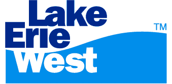 Fifteen years ago, with area economic development agencies wrangling over jurisdictional disputes, a small local group formed to promote a regional identity which would transcend both political boundaries and territorial battles. The name offered: Lake Erie West. This identity would extend outward from the "Crossroads of America," the intersection of the nation's two busiest highways: I-80/90 and I-75. It would know no political boundaries and include many counties and municipalities and parts of two states at the western end of Lake Erie. Today that identity has been embraced by many regional communities, and even economic development agencies are acknowledging the wisdom of a non-political regional identity. This logo is commonly seen on literature from several communities and hundreds of companies in the Lake Erie West region.
![]()
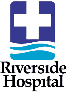 Riverside Hospital had a brand new signature building on its campus; it had a brand new CEO; and it wanted a brand new identity to let people know what was happening. The identity system we delivered was friendly, professional, distinctive, functional, and gave a visual signal of the Riverside name. The color blue in American culture connotes cleanliness, cool precision and professionalism (and water, as well), so we used two hues of blue for the mark. The reverse white waves form a clean break between the more precise cross element and the friendlier wave forms.
For twenty years the logo was a highly visible community presence on the side of the riverfront building, until its sale to ProMedica. The Riverside logo and accompanying system are no longer in use.